DASHBOARDS
Customize your dashboards
Turn your raw data into clear, visual and shareable analyses in just a few seconds.
4.9 / 5

Dashboards that turn numbers into decisions
Time under control
No more lengthy manual work: Finthesis brings together your key indicators for instant analysis.
Expertise enhanced
Accurate dashboards to make fast decisions, support your clients or manage your performance.
Full customization
Select KPIs, visuals, colors and time periods — everything adapts to the way you analyze performance.
Data visualization at your fingertips
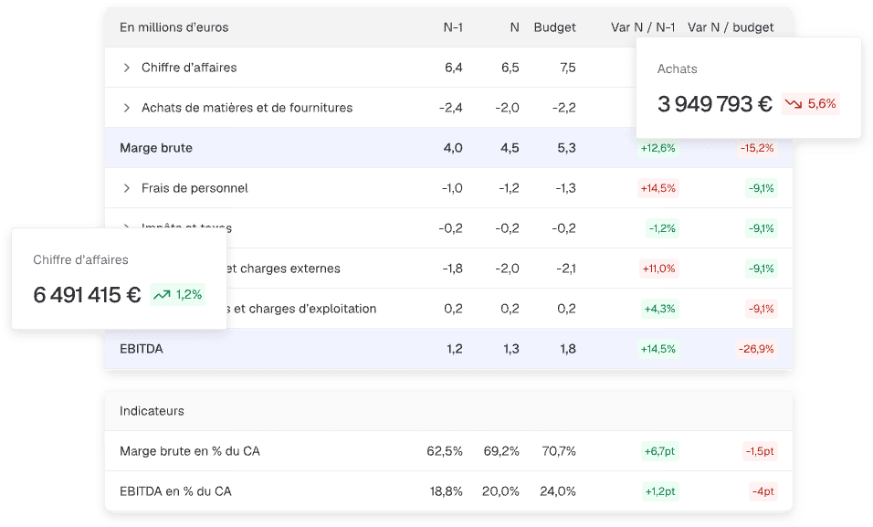
Preconfigured and customizable financial dashboards
From the moment your data is imported, Finthesis provides ready-to-use views that you can customize (time periods, aggregates, format, etc.) to match your business perspective.
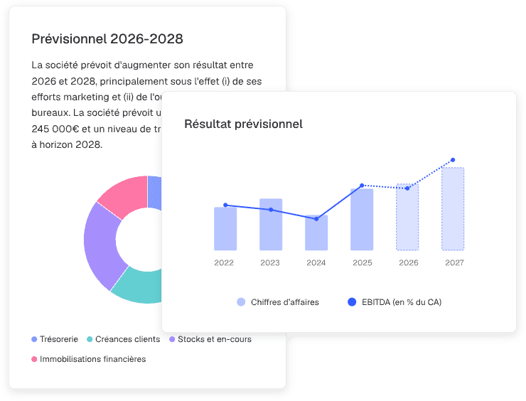
A complete library of finance-ready visuals
Choose from a wide range of chart types selected based on financial best practices to display your indicators clearly and effectively.
Enriched, 360° data
Combine accounting, payroll, non-accounting or analytical data, filter by period, and run segmented or consolidated analyses based on your needs.
Automatic updates and sharing
Your dashboards and visuals refresh automatically whenever your accounting data is updated. Share them or embed them directly into your presentations.
They use Finthesis dashboards
Reviews
“We wanted to offer our clients simple and easy-to-use dashboards to present their accounting data. Finthesis quickly became the obvious choice.”

Your dashboards in 3 steps
Step 1
Data connection / import
Connect your accounting software via API or import your FEC files and general ledgers.
Step 2
Processing and structuring
Finthesis cleans, structures and formats your data to generate key indicators and preconfigured analyses.
Step 3
Export, sharing, distribution
Visualize, present, share: your analyses and charts are ready in one click!
Frequently asked questions
How far can charts be customized?
You can configure visual types, select which data to present, choose time periods, filter by analytical categories, change colors and organize widgets however you like.
How is dashboard data updated?
Data syncs automatically whenever a new FEC file, general ledger or API feed is imported, instantly refreshing your KPIs and charts.
Is it possible to create multiple dashboards for the same project?
Yes, each project can contain as many dashboards and reports as needed — by theme (cash, margins, expenses, etc.), by team, or for specific client needs.
Is data visualization designed for financial reporting?
Yes, the entire structure is built for financial use cases: margin tracking, revenue analysis, cash management, expense trends, forecasting and analytical segmentation.
What visuals are available?
The platform offers a wide library of charts: line, vertical / horizontal bar, stacked vertical / horizontal bar, pie, donut, treemap, bridge, table and text widgets — giving you extensive flexibility to build your financial analyses and reports.
Can dashboards be shared with a client or an internal team?
Yes, you can grant secure access or share selected views only, enabling smooth collaboration between internal teams and clients.

Ready to leverage your data?
Get your first insights in seconds
You haven't seen everything yet
Reporting
Create your financial analyses and benchmarks in no time, without manual formulas, ready to share.
Discover
Forecasts
Model your scenarios and adjust your assumptions for simple, fast, and perfectly structured forecasts.
Discover

ESG and Social
Analyze and showcase your HR and CSR data to turn your reports into drivers of societal performance.
Discover